Branding for roda
2026
BRANDING & CONCEPT IDEATION FOR RODA,
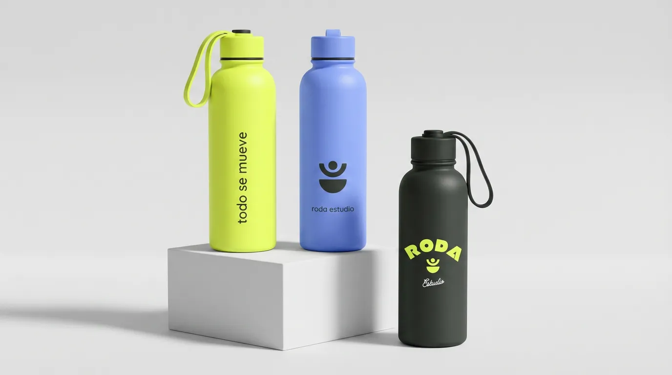
Brand Identity
Art Direction
Naming & Concept
RODA is more than a
fitness studio. It's a space built around the idea that
the body is always in motion: cycling, evolving, starting over. This project explores
a brand identity rooted
in that philosophy: fluid, human, and built to last.
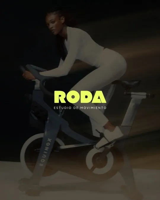
The brief was clear: build a brand that feels as alive as the movement it represents. RODA needed to speak to adults and kids alike, stay relevant beyond fitness trends, and carry a visual language rooted in motion, flow and energy. The concept was built around one truth — the body is always in a cycle. It moves, learns, grows and starts again.


Next project
Magazine project